IELTS Writing Task 1 - Academic
Understanding and Describing Graphs, Charts, and Tables
Explanation of Task 1➧ Writing a 150-word report based on visual data
➧ graphs, charts, tables, diagrams
Time allocation
➧ 20 minutes for Task 1
Assessment criteria
➧ Task achievement, coherence and cohesion, lexical resource, grammatical range, and accuracy
Types of Visual Data
Types of visual data➧ Line graphs, bar charts, pie charts, tables, and process diagrams
Key features to identify
➧ Trends, comparisons, and changes over time
Structure of the Report
Introduction➧ Paraphrase the question and introduce the visual data
Overview
➧ Summarize the main trends or key features
Details
➧ Describe specific data points, trends, and comparisons in more detail
Language for Describing Data
Vocabulary for trends➧ Increase
➧ Decrease
➧ Fluctuate
➧ Remain stable
➧ More Vocabulary Here
Phrases for comparisons
➧ Higher than
➧ Similar to
➧ Compared with
➧ More Phrases Here
Describing time periods
➧ Over the period
➧ From 2000 to 2020
➧ During the first half
Analyzing a Sample Task
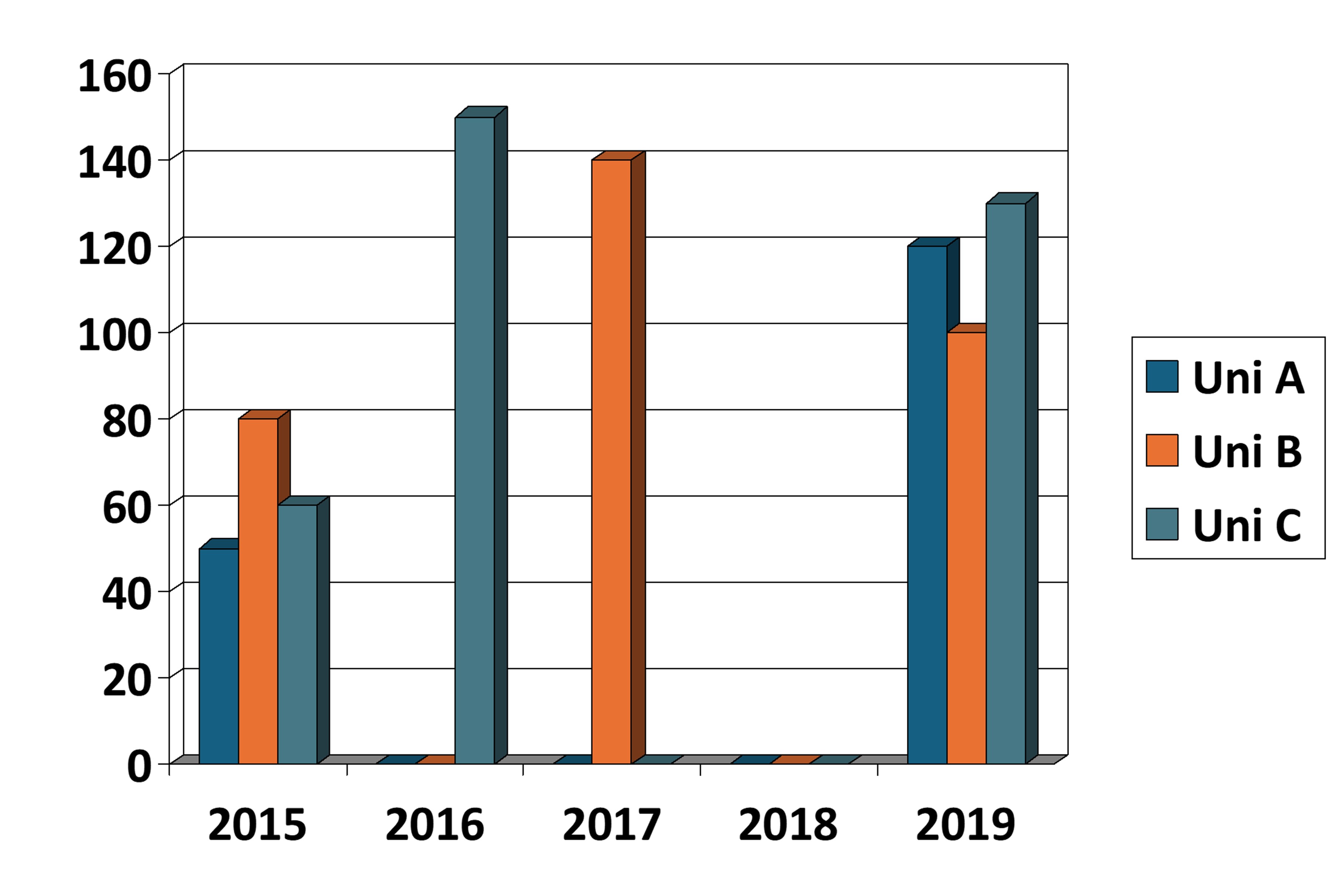
Graph Description➧ Number of International Students
Task
➧ You should spend about 20 minutes on this task.
The graph above shows the number of international students enrolled in three different universities over a five-year period from 2015 to 2019.
Summarize the information by selecting and reporting the main features, and make comparisons where relevant.
Write at least 150 words.
Writing Practice
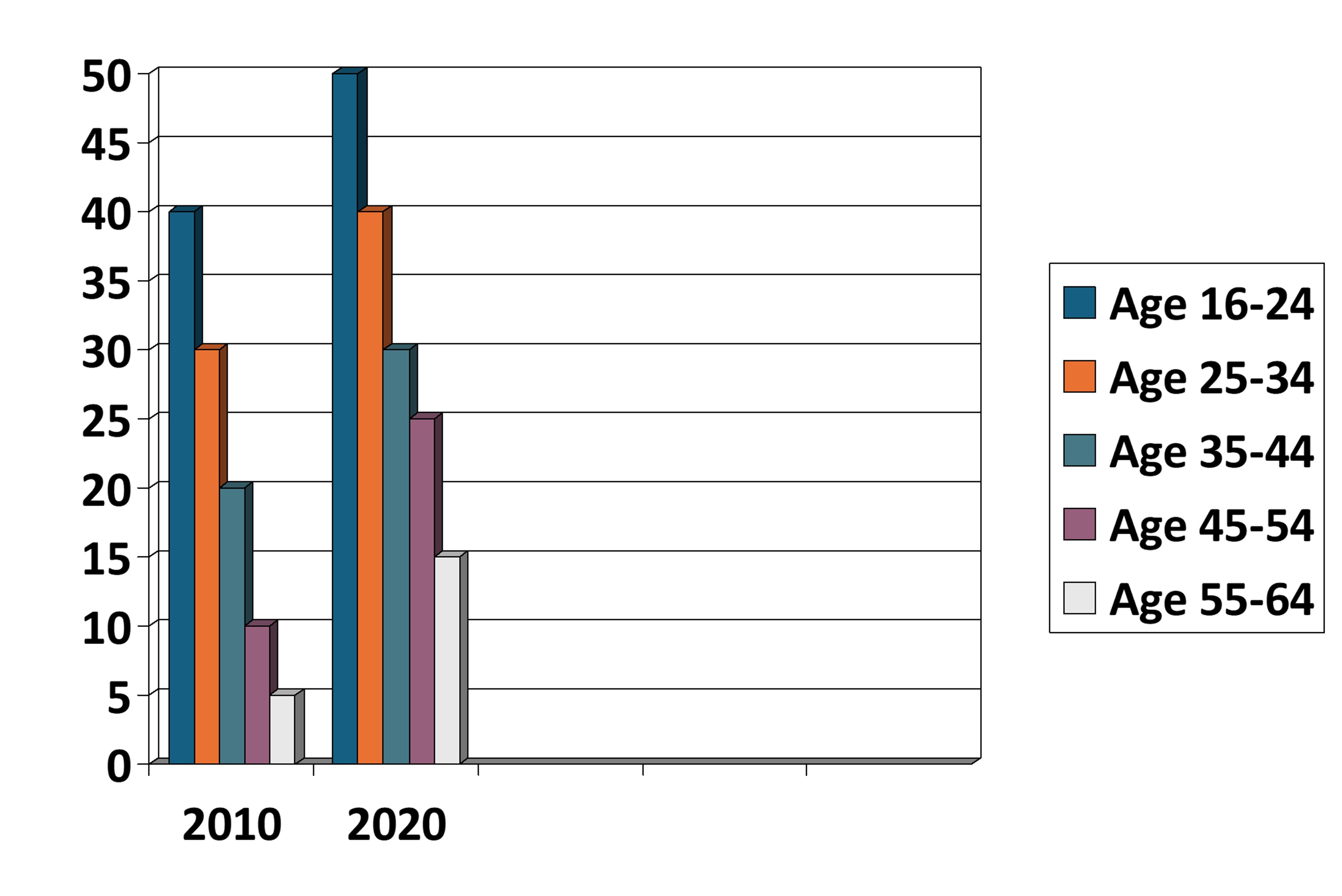
Bar Chart Description➧ Percentage of people (%)
Task
➧ You should spend about 20 minutes on this task.
The bar chart above shows the percentage of people in five different age groups who attended music concerts in one European country in 2010 and 2020.
Summarize the information by selecting and reporting the main features, and make comparisons where relevant.
Write at least 150 words.
Instructions for Students
Introduction➧ Paraphrase the task question, introducing the chart and what it represents.
Overview
➧ Summarize the main trends in the data. Highlight any significant changes over time.
Details
➧ Describe the data in detail, making comparisons between the different age groups and between the years 2010 and 2020.
➧ Focus on any noticeable trends, such as which age group saw the most significant increase in concert attendance.
Conclusion | Optional
➧ Briefly summarize the overall trend or make a concluding statement about the data.
Common Mistakes to Avoid
➧ Overcomplicating the description or using irrelevant information➧ Failing to write a clear overview or neglecting key trends
➧ Making grammatical errors or using inaccurate vocabulary
➧ Writing Task 1 - General