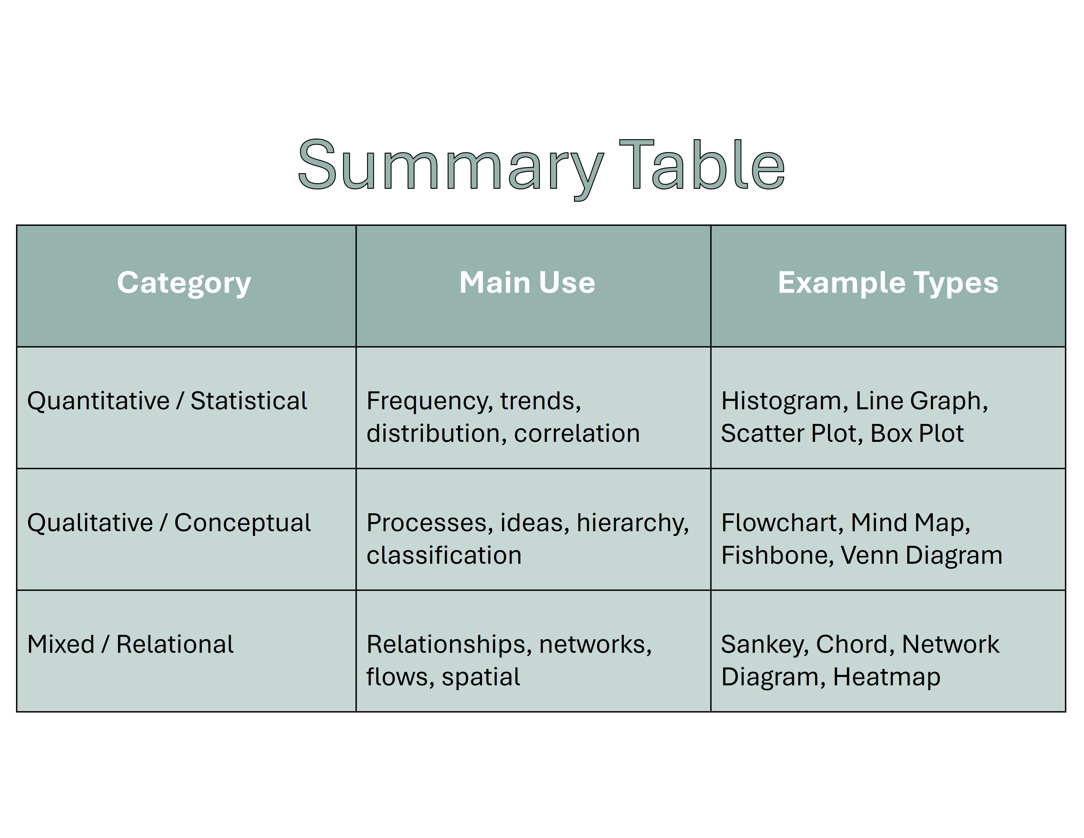
Summary
General Introduction Phrases
Use these to introduce the visual data➧ The chart | graph | diagram illustrates...
➧ This visual representation shows...
➧ According to the data presented...
➧ The figure demonstrates...
➧ The table outlines...
➧ This infographic summarizes...
➧ The diagram provides an overview of...
➧ The image presents information about...
Describing Trends | Quantitative Data
Upward Trends➧ Increase, rise, grow, climb, go up, surge, soar, peak
➧ Sales increased sharply in 2023.
➧ There was a gradual rise in population.
Downward Trends
➧ Decrease, fall, drop, decline, go down, plummet, dip
➧ The number of users dropped steadily.
➧ Profits plummeted in the third quarter.
No Change | Stability
➧ Remain steady, stay constant, level off, stabilize
➧ The rate remained stable over the decade.
Fluctuations
➧ Fluctuate, vary, oscillate
➧ The data shows fluctuations in temperature.
Describing Amounts and Percentages
➧ A large majority (70%) agreed…➧ Only a small fraction of respondents...
➧ Approximately one-third of the population…
➧ A significant proportion showed interest…
Describing Comparisons
➧ X is twice as high as Y.➧ In contrast to A, B shows a marked difference.
➧ There are noticeable similarities between...
➧ While X remained steady, Y rose significantly.
➧ A and B showed opposing trends.
Describing Processes or Cycles | Conceptual Diagrams
➧ The process begins with…➧ Following this, the data is analyzed…
➧ This leads to…
➧ The cycle repeats itself.
➧ Each step in the flowchart represents…
Interpreting and Analyzing the Data
➧ This suggests that...➧ It is evident from the data that...
➧ The graph indicates a strong correlation between...
➧ One possible explanation for this trend is...
➧ The most noticeable change occurred in...
➧ This may imply a shift in consumer behavior.
Concluding Statements
➧ To sum up, the data highlights...➧ Overall, the chart shows a clear trend of...
➧ In conclusion, there has been a steady increase in...
➧ The visual clearly supports the claim that...
Example Sentence | IELTS Task 1 Style
The line graph illustrates the number of tourists visiting four different countries between 2010 and 2020. Overall, all countries experienced an upward trend, with Country A peaking in 2018, while Country D remained relatively stable throughout the period.More Lessons ➧ Here
About Blossomings
Blossomings is an educational platform dedicated to providing high-quality
learning materials, worksheets, and structured lessons for learners worldwide.
Our goal is to make learning simple, engaging, and accessible for everyone.