Graphs
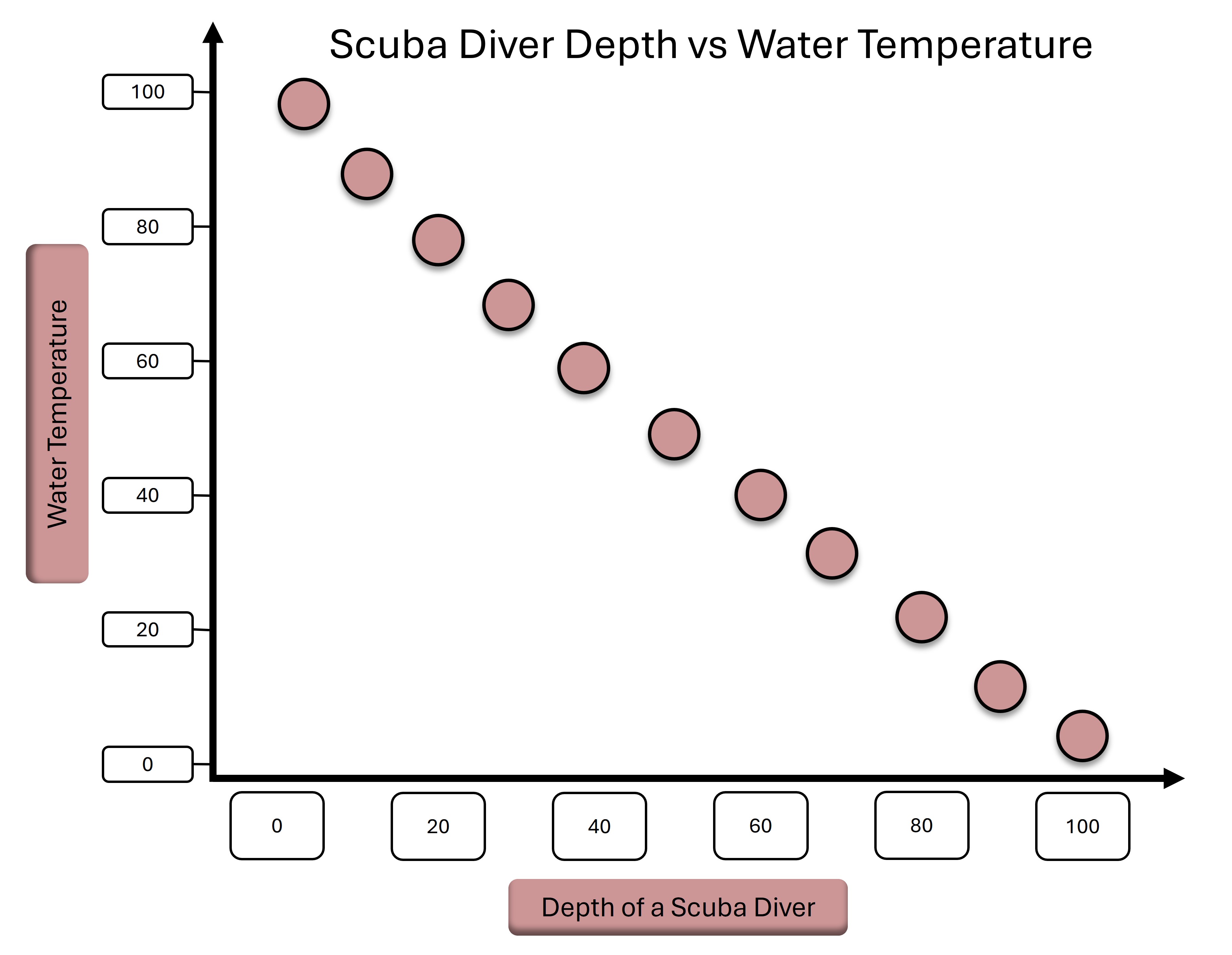
➧ Displays correlation between two numerical variables.
➧ Shows data points as dots.
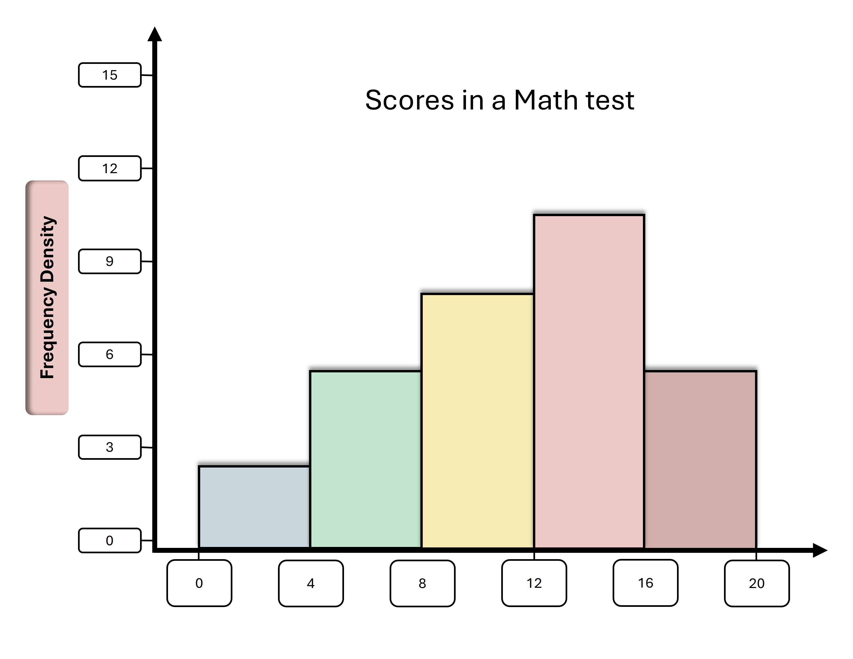
➧ Shows frequency distribution of continuous data.
➧ Similar to bar charts but grouped into intervals.
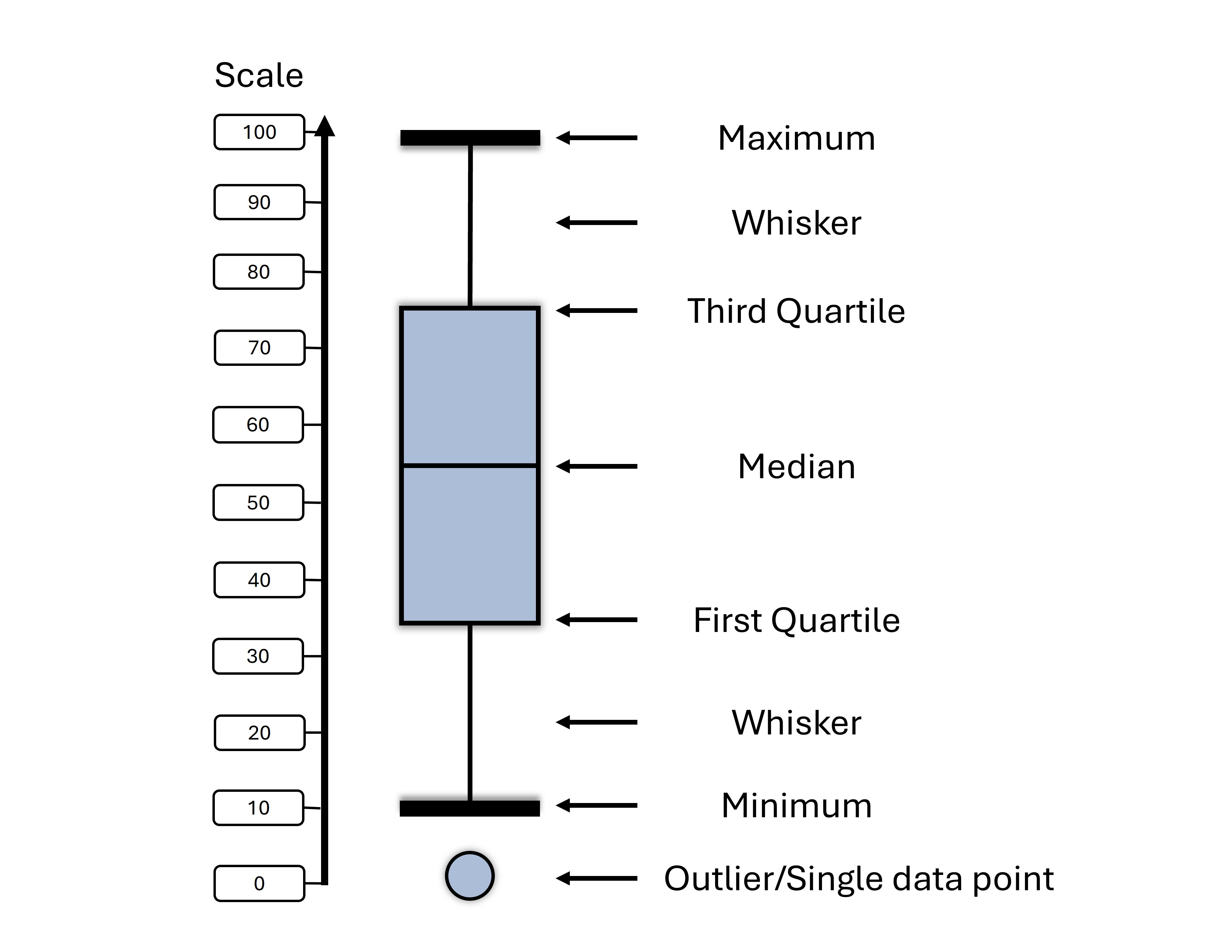
➧ Shows distribution, median, quartiles, and outliers.
➧ Good for comparing groups.
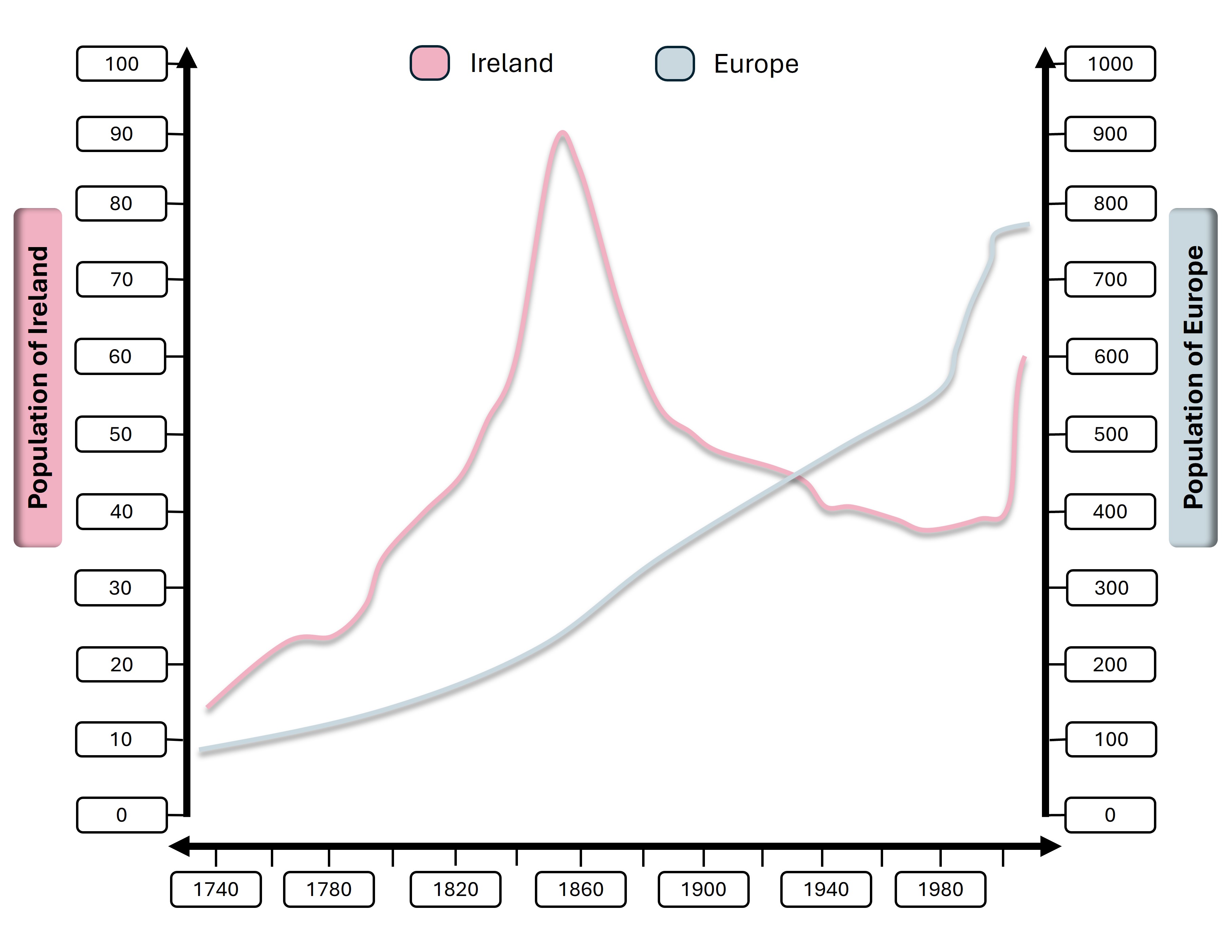
➧ A line graph that shows data points at successive time intervals.
➧ Common in economics, weather tracking, etc.
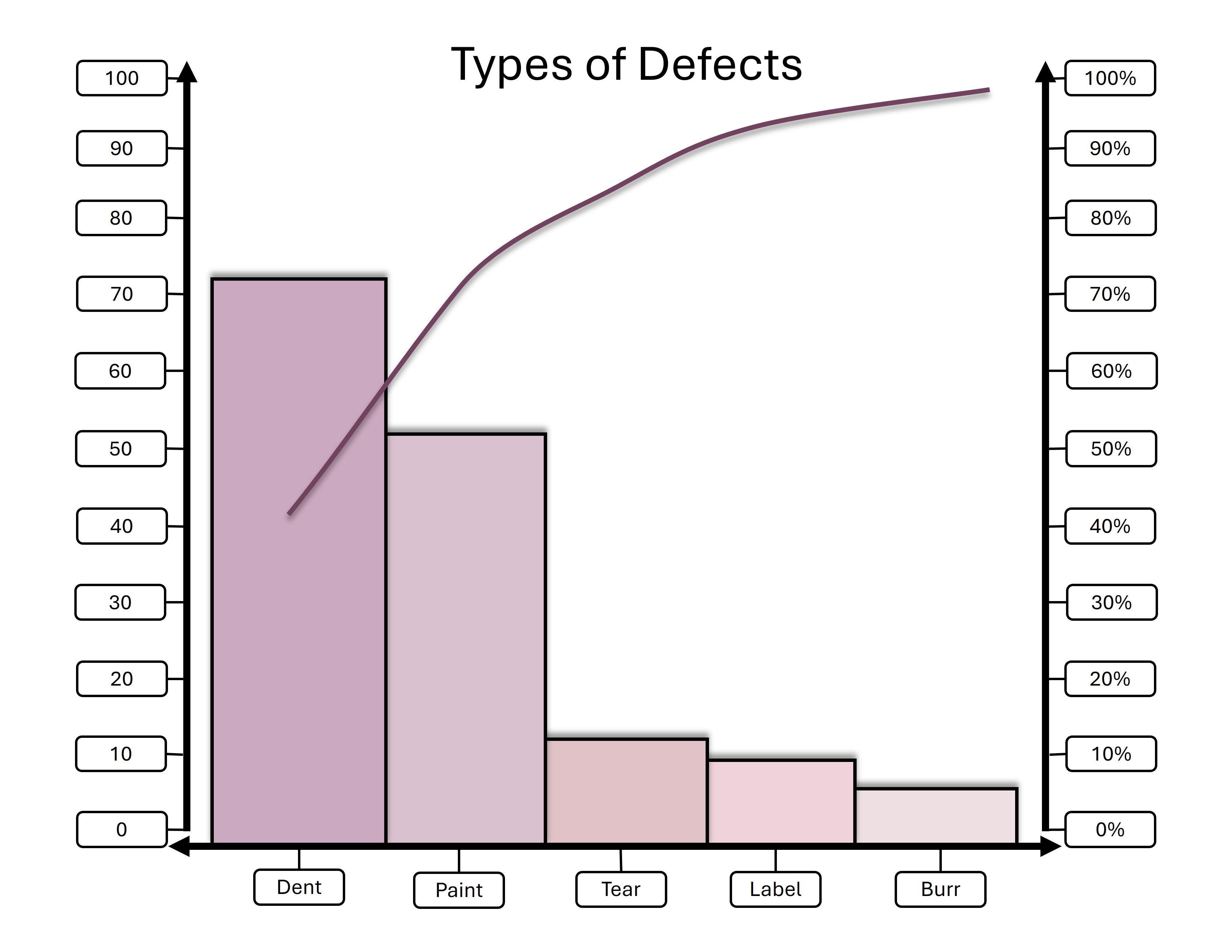
➧ A bar chart + line graph.
➧ Highlights the most important factors (80/20 rule).
More Lessons ➧ Here
About Blossomings
Blossomings is an educational platform dedicated to providing high-quality
learning materials, worksheets, and structured lessons for learners worldwide.
Our goal is to make learning simple, engaging, and accessible for everyone.