Charts
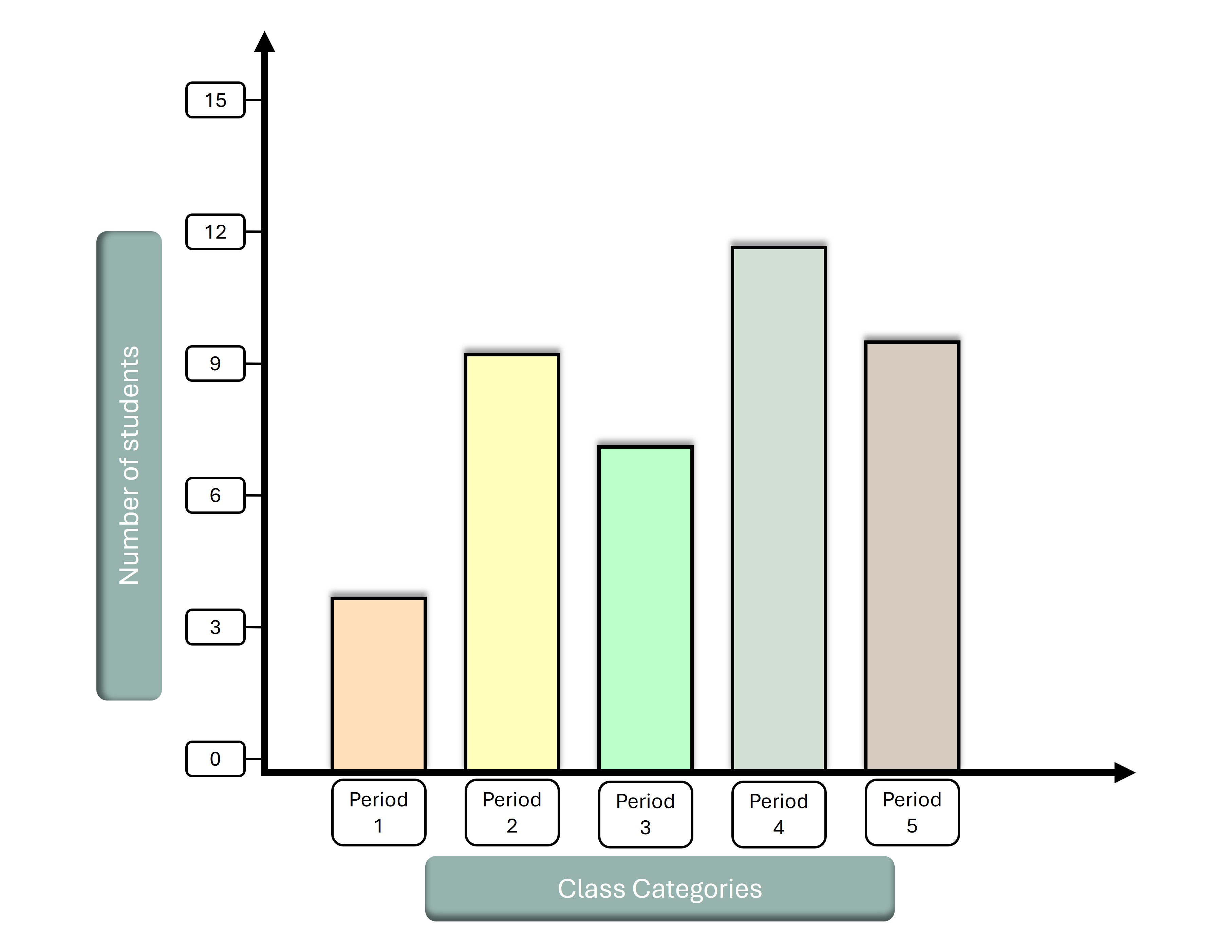
➧ Shows quantities or frequencies with rectangular bars.
Types
➧ Vertical bar chart
➧ Horizontal bar chart
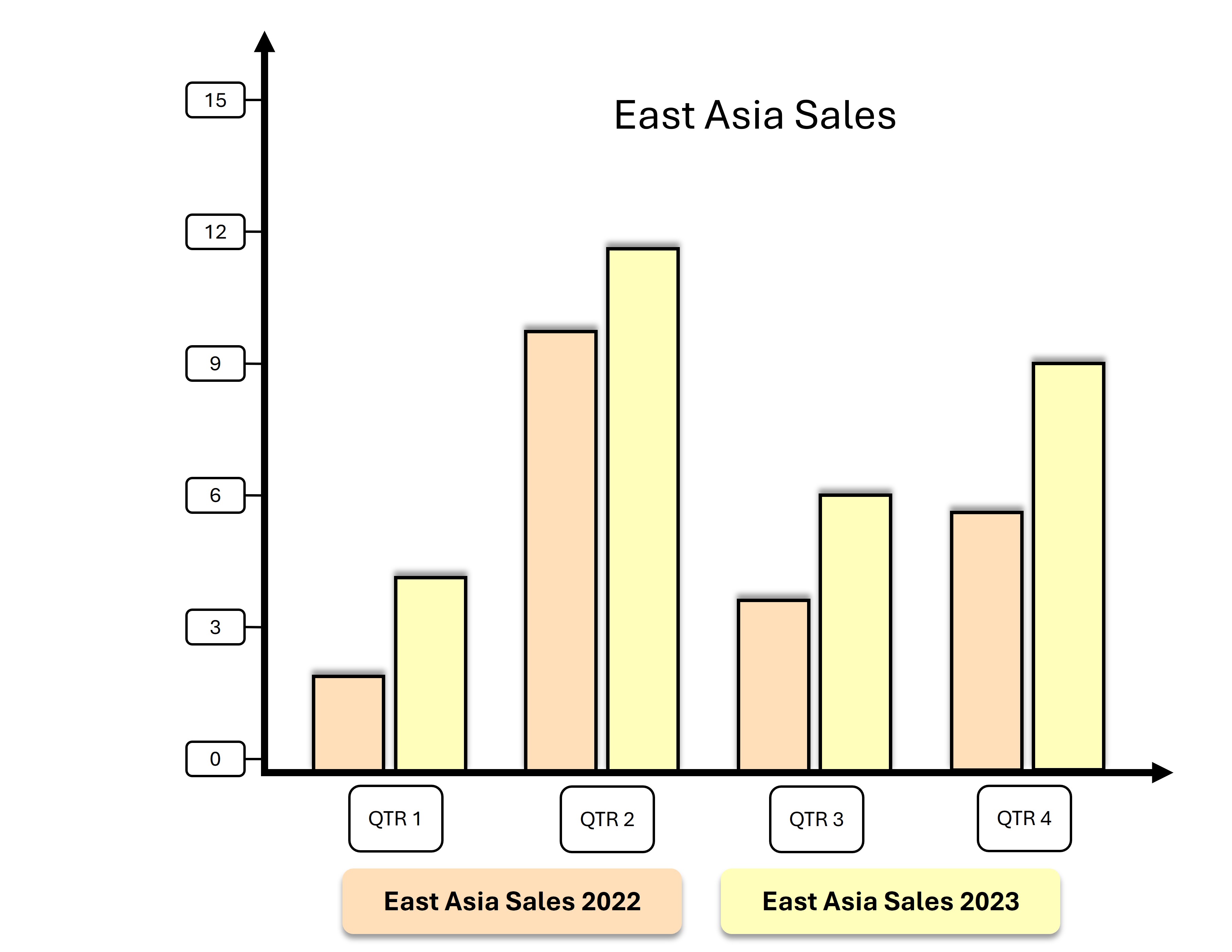
➧ Grouped bar chart
➧ Stacked bar chart
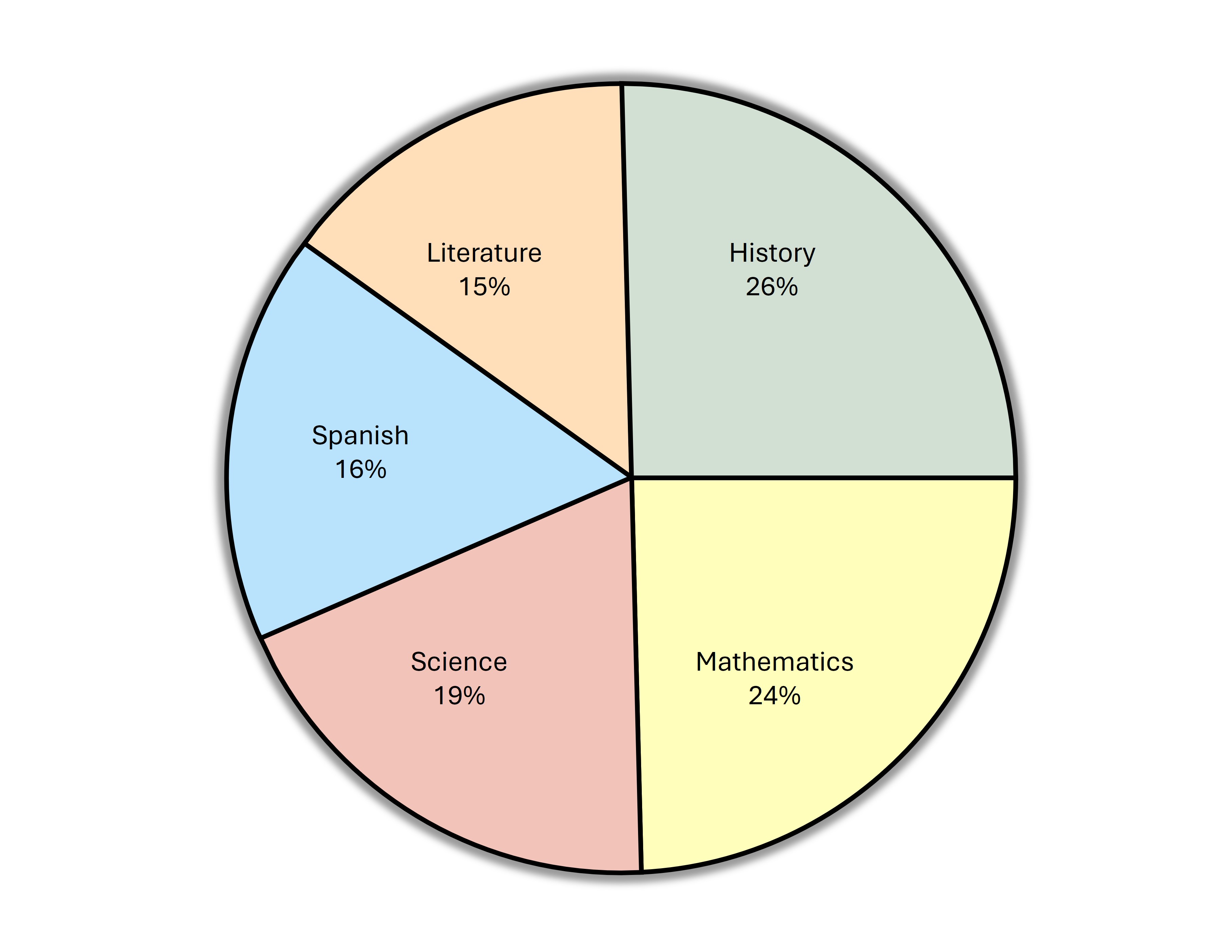
➧ Shows proportions of a whole as slices of a circle.
➧ Best for showing percentages or distribution.
➧ Similar to bar charts but vertical.
➧ Used for comparing values across categories.
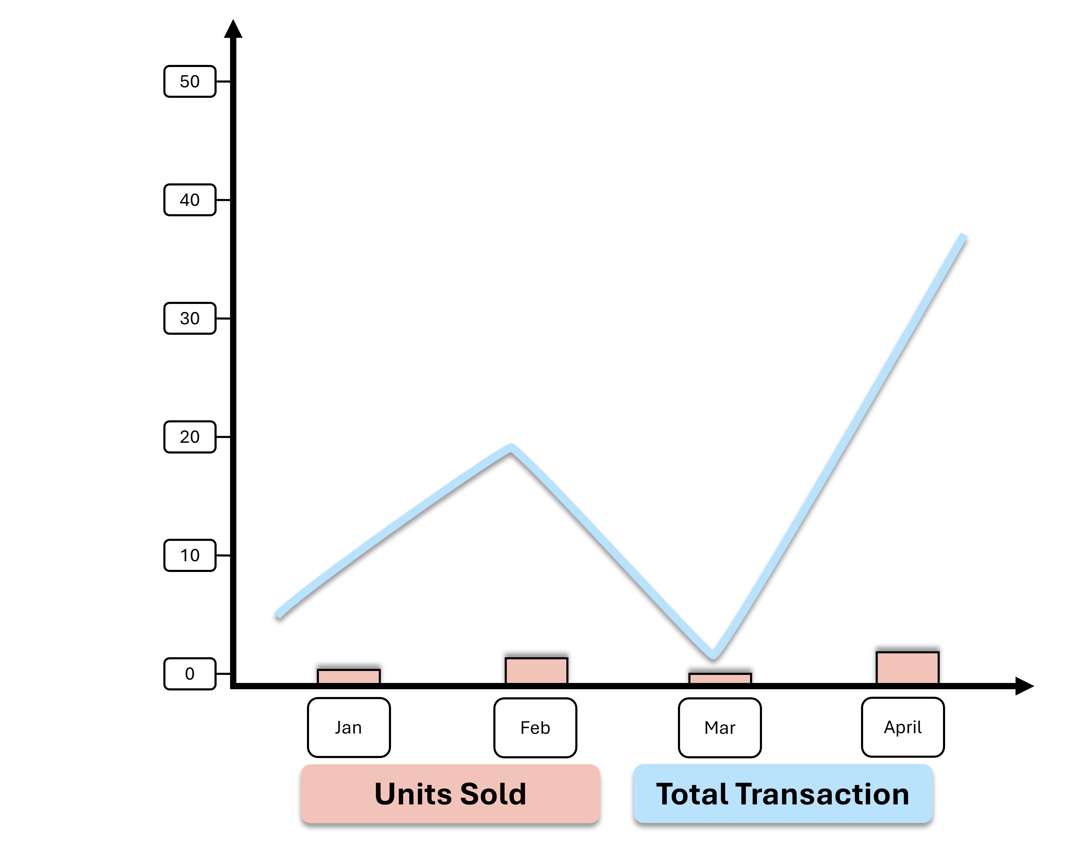
➧ Displays trends over time | time series.
➧ Points connected by straight lines.
➧ Can be single or multiple lines.
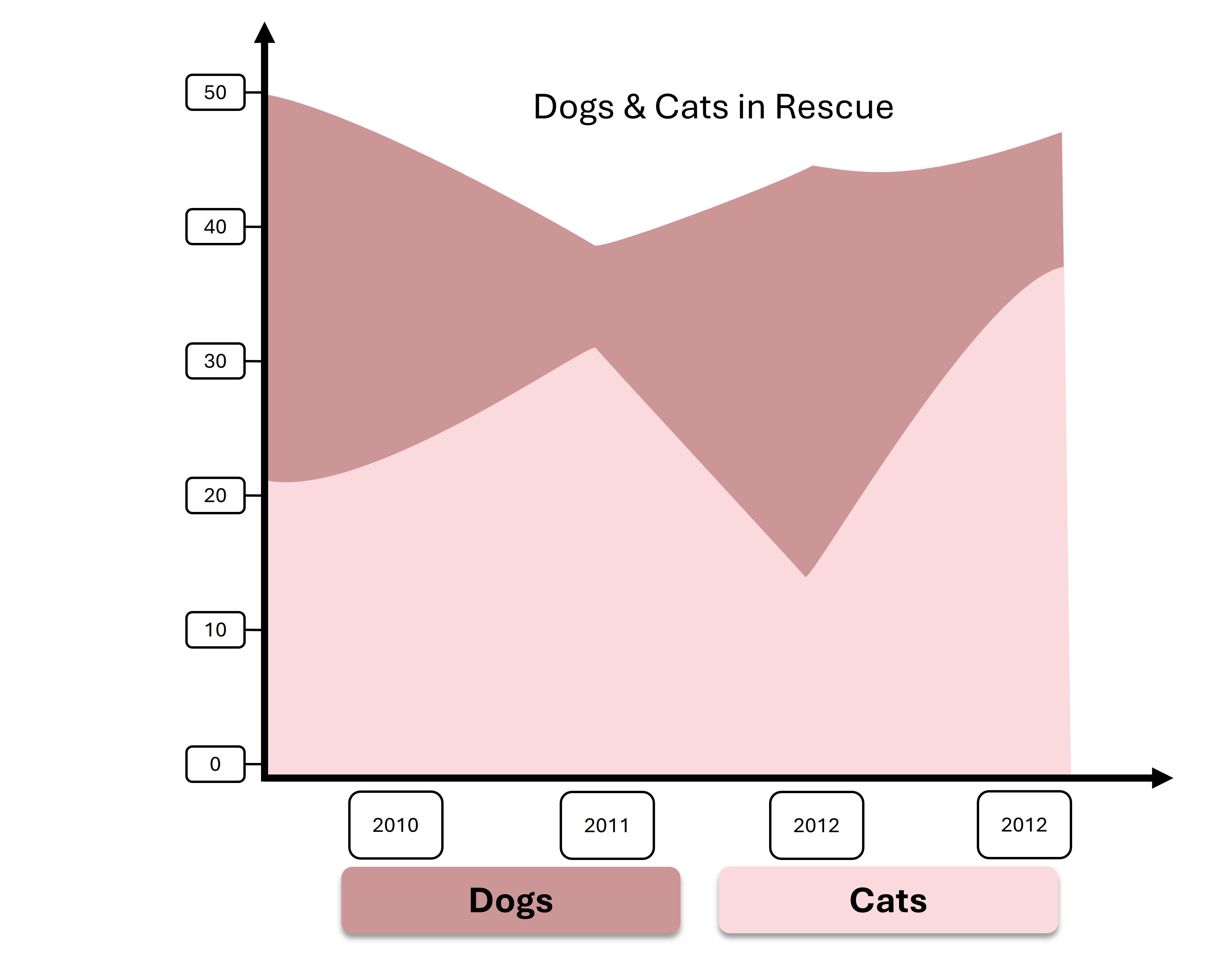
➧ Similar to line charts but with the area beneath the line filled in.
➧ Emphasizes volume or cumulative data.
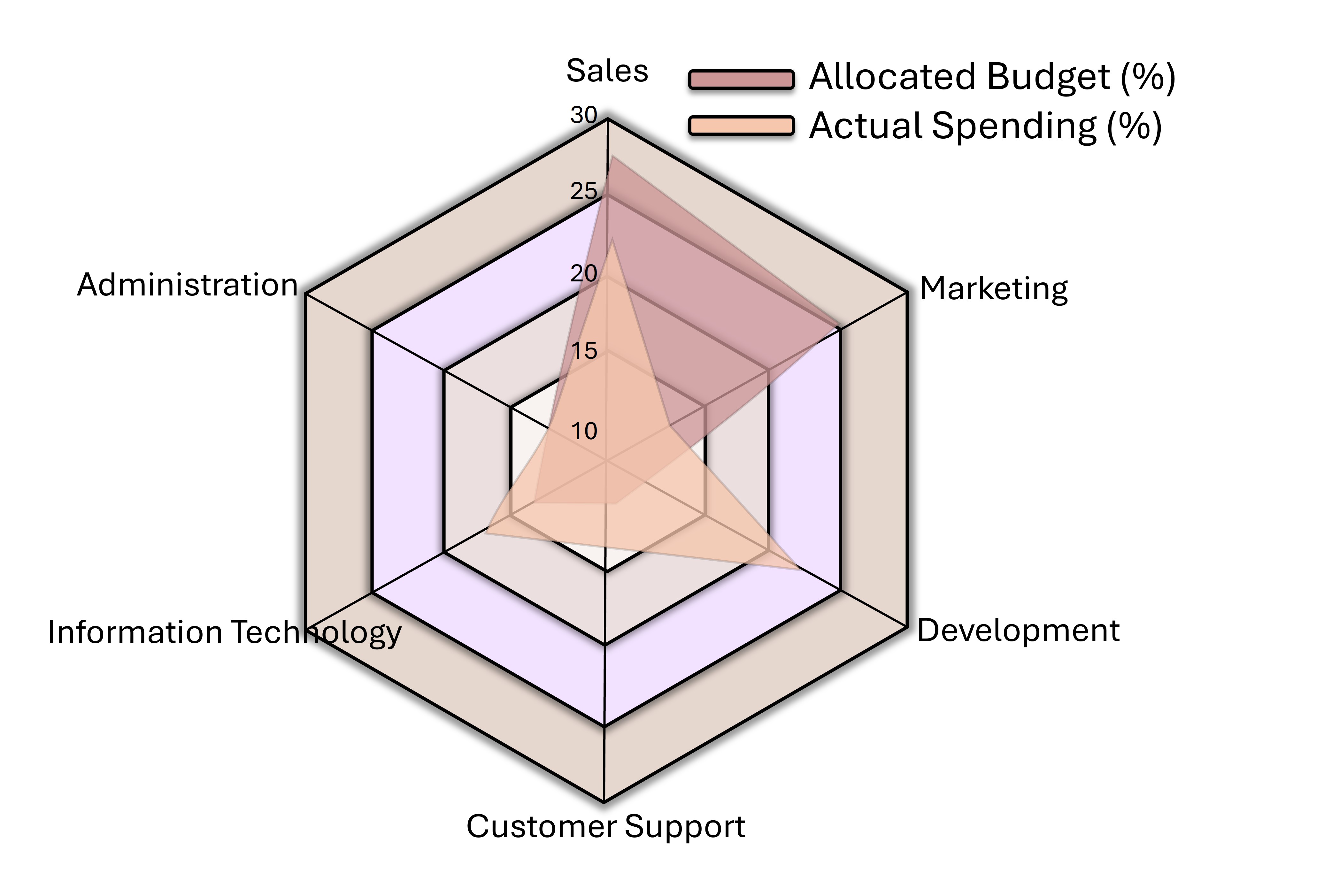
➧ Shows multivariate data with multiple axes.
➧ Useful for performance comparisons | e.g., skill levels.
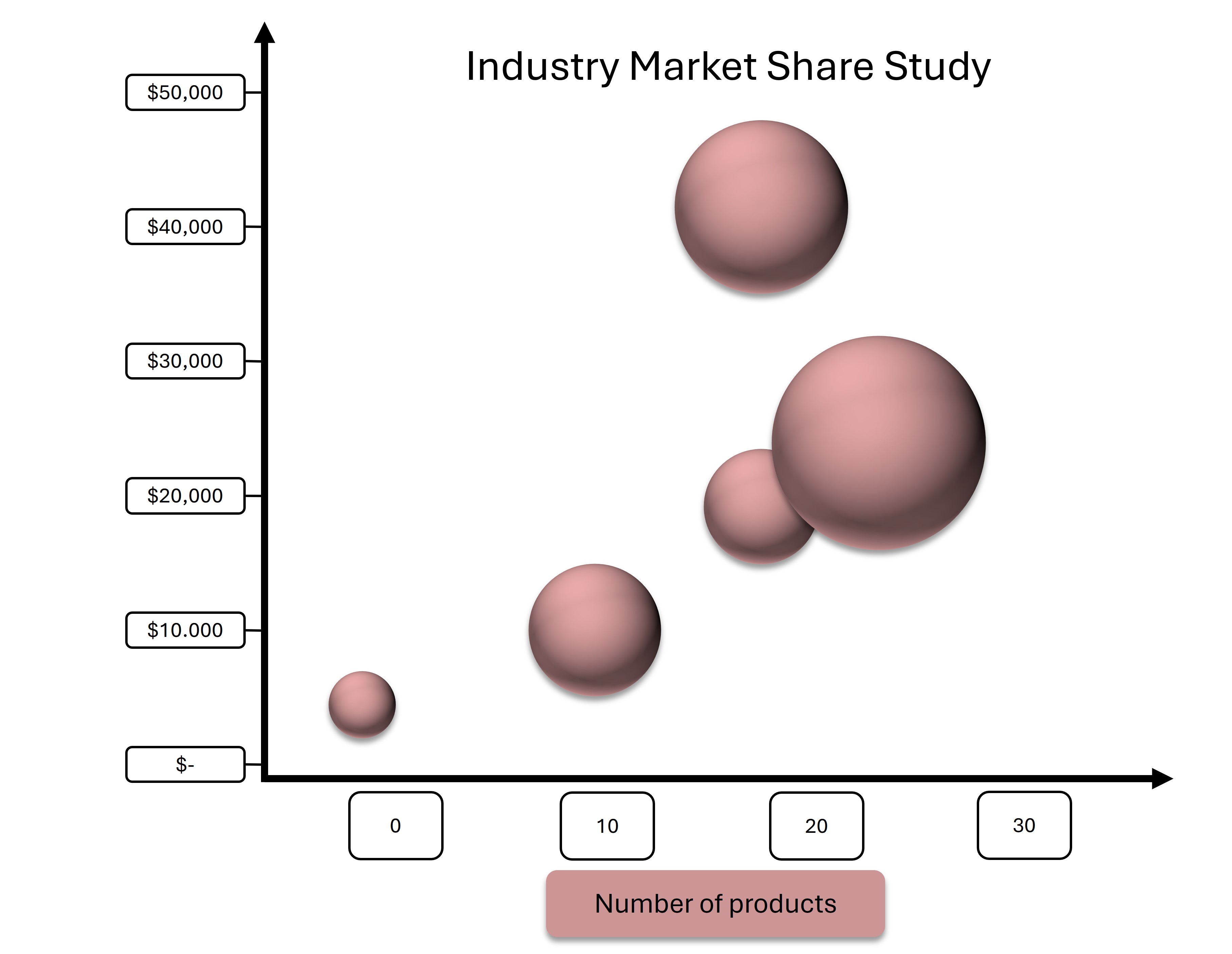
➧ Extension of scatter plot.
➧ Adds a third dimension with bubble size.
➧ Shows relationship between three variables.
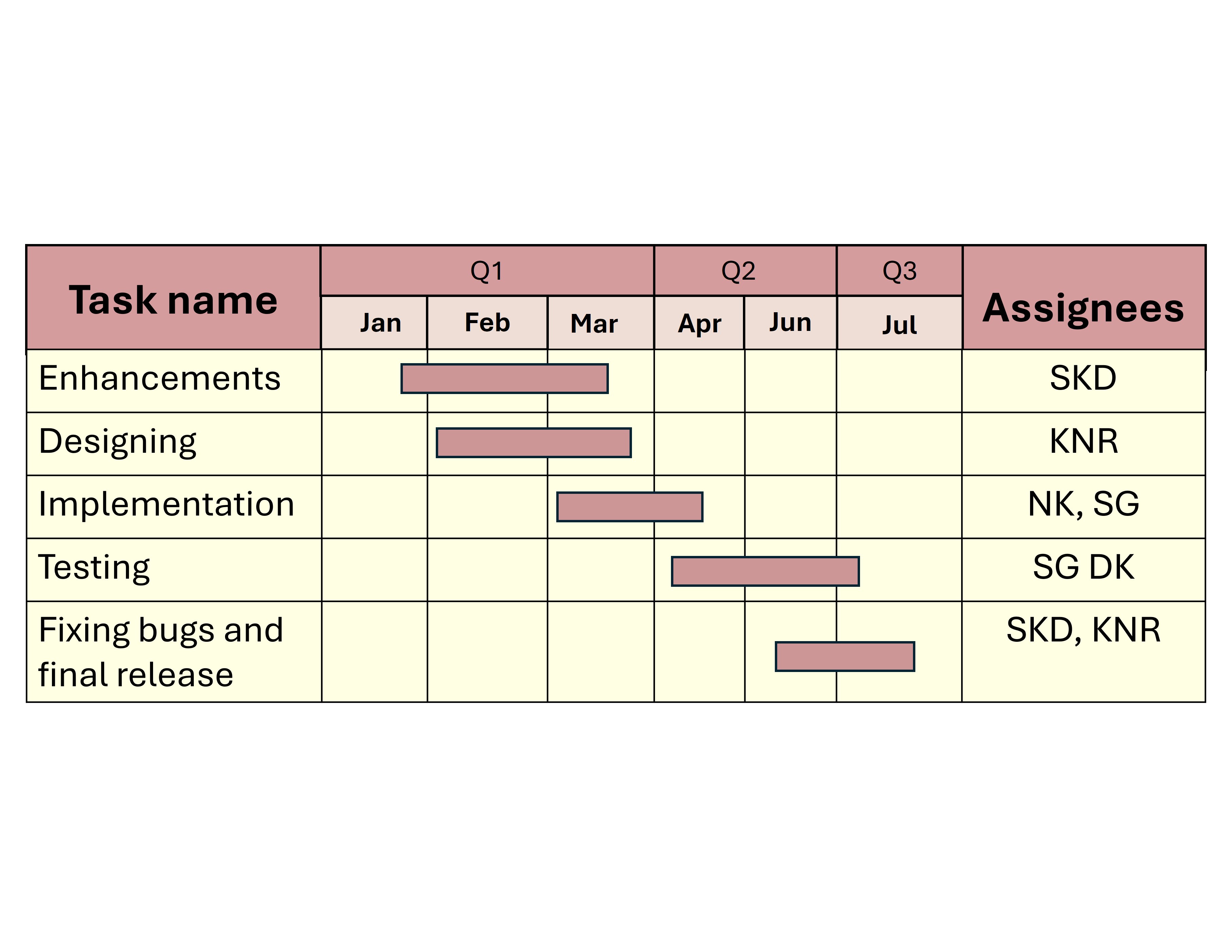
➧ Used in project management.
➧ Displays project tasks along a timeline.
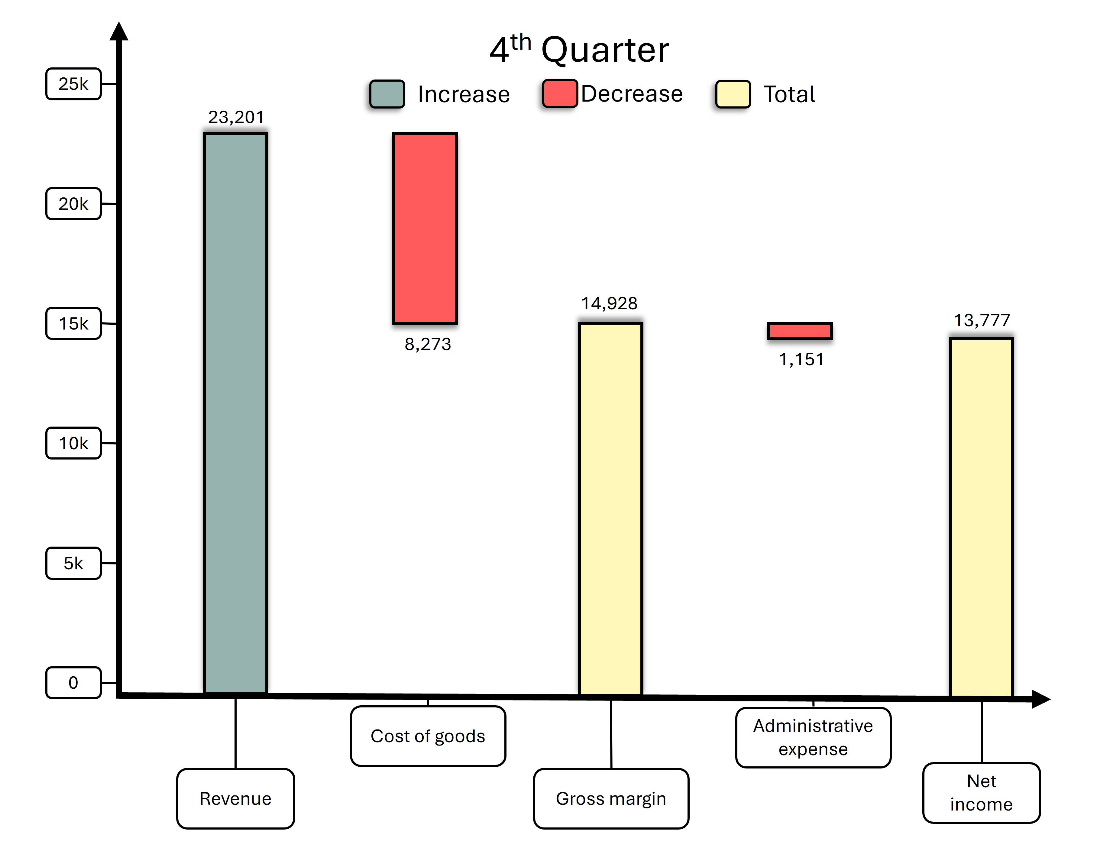
➧ Shows cumulative effect of sequentially introduced positive or negative values.
➧ Often used in financial data.
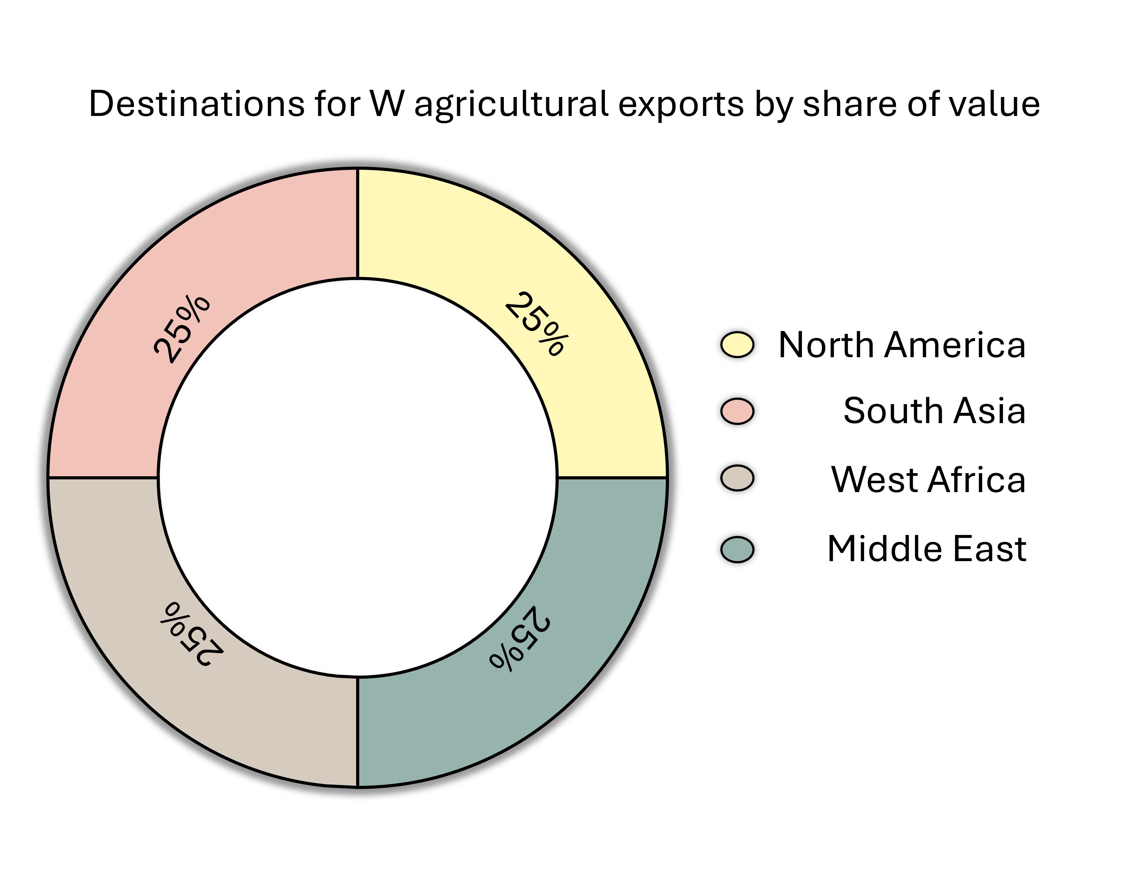
➧ Variation of pie chart with a blank center.
➧ Used for showing part-to-whole relationships.
More Lessons ➧ Here
About Blossomings
Blossomings is an educational platform dedicated to providing high-quality
learning materials, worksheets, and structured lessons for learners worldwide.
Our goal is to make learning simple, engaging, and accessible for everyone.